The shift to a more varied and weirder aesthetic that NOW editor Eric Reynolds began in #4 blossomed into what feels like the most personal anthology he’s ever edited in NOW #5. By that, I mean it’s the issue that seems closest to his own personal aesthetic as a reader, irrespective of his job as an editor who wants to sell books to a receptive general audience. Reynolds has talked about how the lightbulb moment for him with regard to alternative comics was reading Chester Brown’s Yummy Fur #1. In particular, the scene where Ed is walking down the street and breaks his leg was such a startling, absurd, and hilarious moment that it served as a defining point for Reynolds’ particular aesthetic. That aesthetic is somewhere between the transgressive weirdness of underground comics (though more Gilbert Shelton goofiness than R.Crumb or S. Clay Wilson violence) and the first wave of alternative comics of the 1980s.
The shift toward that kind of experimental weirdness with NOW #4 is in full effect in NOW #5, an issue without regulars such as Noah Van Sciver, Dash Shaw, or Eleanor Davis. Instead, this issue puts Reynolds’ willingness to publish experimental cartoonists from around the world on display, while challenging him to sequence it in a way that makes sense.
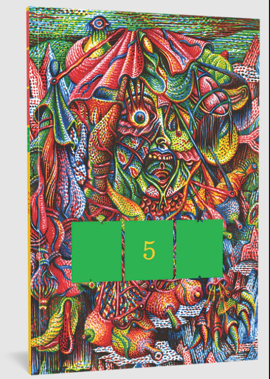
It’s fitting that the cover is by Stephane Blanquet, a longtime fixture in the French underground comics scene who has since become a multimedia artist. The figure is grotesque but colorful; it’s less frightening than it is just enormously strange. It feels like a herald for what’s inside the issue. Beginning an issue with some Theo Ellsworth weirdness is another sign that this is going to be a weird one; like Blanquet, his drawing style has an almost obsessive use of swirling lines.
The cartoonist DRT, with his throwback 1930s cartooning style, contributes a story called “Bloo-Dax.” It’s meant to emulate classic adventure cartooning in the vein of Alex Raymond, but it has a thoroughly modern sensibility in terms of its violence and sheer weirdness. A lot of the character design is reminiscent of Paper Rad, but there’s still a fairly straightforward fantasy quest story being told here. The entire thing is unsettling in a good way, particularly thanks to his use of color. The faded beige and sepia backgrounds contribute to this aesthetic.

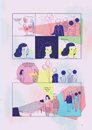
DW is next with the closest he comes to a conventional narrative, with his swirling color fields in each panel coalescing around a magical serpent that calls on Aztec imagery. In a brilliant bit of editing, Reynolds completes a suite of stories with Ana Galvañ’s Kafkaesque interview story that begins with a set of color blocks that seem to indicate that she’s being disintegrated and put back together (ala a Star Trek transporter) in order to go through a byzantine series of steps for an interview. Moving between DW’s use of color to create an emotional affect in seemingly abstract patterns to a story that starts with an abstract color pattern and segues into a strange but otherwise conventional narrative is the best kind of transition.

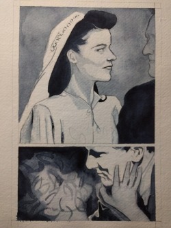
The transition to the experimental artist Maggie Umber’s “The Daemon Lover” is deliberately jarring. Entirely wordless, this whorl of paints and ink smudges is an adaptation of a story with its roots in Scottish ballads and later told by horror master Shirley Jackson. In the original story, a woman eagerly awaiting her wedding day feels anxiety when her betrothed doesn’t show. When it appears that he doesn’t actually exist, it casts doubt on her sanity, which is an oblique reference to the ballads featuring the Demon Lover who takes his bride to hell. In Umber’s version, drawn to emulate the setting of Jackson’s 1945 story, the woman wordlessly obsesses over her dress, what she’ll look like as a bride, imagining her future husband (who has a strangely blank face), until she desperately goes in search of him, finding only an empty room at the address she has for him. Umber draws the narrator as though she was a Hollywood glamour queen like Ava Gardner, heightening the level of fantasy and self-delusion hinted at in the original story.
Turning on the theme of lost or misplaced love, Eroyn Franklin’s story of a young woman and her cabin gets increasingly demented with each passing page. Using a layout that superimposes panels on top of a larger page colored in a blue wash, the narrator talks to her small, secluded cabin. Her narrative relates various examples of sexual trauma that she experienced with men over the years. At a certain point, it becomes obvious that she views the cabin not just as a home, not even just as a kind of entity to talk to, but as a sexual partner. She even leaves the cabin in a fury when she accidentally cuts herself, then apologizes profusely when she returns. In the final scene, when she’s rubbing herself on a beam of wood and orgasms, the meaning of the first scene of the story becomes more apparent. After hiking through a gorgeous world of nature, she says, “Damn, I wish I still smoked.” It’s not because she wants to smoke cigarettes, but because she misses the experience of smoking after a sexual experience. For her, at this point, the cabin and nature itself are something she looks at as a loving, giving partner. Given the litany of woes she relates to the cabin (and the reader) regarding both lovers and jobs in the city, there’s something to this line of emotional logic.
Roman Muradov’s “Raincheck” uses his typical spectacular use of moody graywash art in a manner that’s surprisingly simple. In the midst of a torrential rainstorm (and Muradov thrives in depicting rain), a woman moves a body into her car and is stopped by the police. The horror comes not when she tells the cop that there’s a body in the bag in the back, it comes when the cop tells her there’s nothing in the bag. This is a subtle, beautiful moment of horror, and Muradov’s spare and scratchy line is restrained in depicting the characters and their expressions.
Jose’ Quintanar’s piece is fascinating and weird, but it upsets what had been a flow in the issue that has been remarkably seamless, despite the varying subject matter and styles. The template for each page is a 24-panel grid; some panels are meant to create a gestalt image (if a slightly fractured one) and others are meant to be read rapid-fire. It’s about a teen boy obsessed with Larry Bird. He meets a disc jockey carrying a cross around as part of a project reconciling Christianity with modern music, and they bond. Both characters are living entirely in their own worlds; the short, chubby boy imagines himself as a basketball star and the DJ thinks of himself as a kind of sage. Theirs is a sweet moment of connection, symbolized by the DJ buying him ice cream before they go their separate ways.
My favorite piece was Walt Holcombe’s “The Asshole In The Hat.” As a fellow asshole in a hat, this piece spoke to me directly and hilariously. Holcombe’s return to comics is certainly welcome, and he’s in top form as a cartoonist and humorist here as he does autobiographical comics. Holcombe confesses to social anxiety AND a need for attention, and for him, a hat is symbolic of that cry for attention. He notes that the line between vanity and self-expression is a thin one, especially as the utility of the men’s hat has greatly decreased. His cartooning is crisp, funny, and expressive, and he weaves in his own insecurities with cultural history as a kind of personal mission statement similar to his comic on meditation in NOW #4. Holcombe has that understanding of flow, gesture, and panel-to-panel transitions that make his comics irresistible to read once you lay eyes on them.
Speaking of transitions, the transition from Holcombe to Walker Tate is another awkward one. Tate’s crisp line art and surreal story are anxiety-producing in every panel, as a broken can opener leads to a number of other calamities. It segues nicely into Keren Katz (the low-key MVP of NOW to date) and her typical use of strange, warped angles for her figures. The story revolves around a shopping cart, but more to the point, it revolves around the history of a relationship related to the objects kept in the car. When the cart is taken away, Katz tells of doing what feels like an interpretive dance as she tells the history of the relationship in reverse.
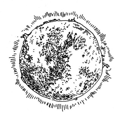
Darin Shuler and Jesse Reklaw round out the issue on a lighter note. Shuler’s strip uses bright colors to tell the story of a kid reading the funny pages, only to find himself absorbed by a comic strip and for a cartoon dog to emerge to see the kid trapped in a panel. It’s a nice chaser after all of the weirdness of the issue. Reklaw works in a completely new style, employing a cartoony line and depicting his characters as anthropomorphic food items with a muted color scheme that gets across the formal qualities of the food just enough to really get the full impact of the approach. The story follows a nihilistic hot dog who grudgingly helps some kids buy booze and complains about television to his friend at a bar, but who ultimately finds himself in a moment of aesthetic bliss gazing at the stars. It feels like something out of an old issue of Eightball, but at the same time, it’s very much within Reklaw’s aesthetic.
Like NOW #4, the fifth issue does not quite cohere. Reynolds is faced with a nearly impossible sequencing task toward the end, as his run of clever transitions runs dry. That said, the anthology does have to have a certain page count, and Reynolds does his best faced with that restriction. Once again, Reynolds doesn’t take the easy way out with regard to the content of the issue; his commitment to providing as wide a variety of styles that appeal to him as possible is admirable.
SOLRAD is made possible by the generous donations of readers like you. Support our Patreon campaign, or make a tax-deductible donation to our publisher, Fieldmouse Press, today.

Leave a Reply