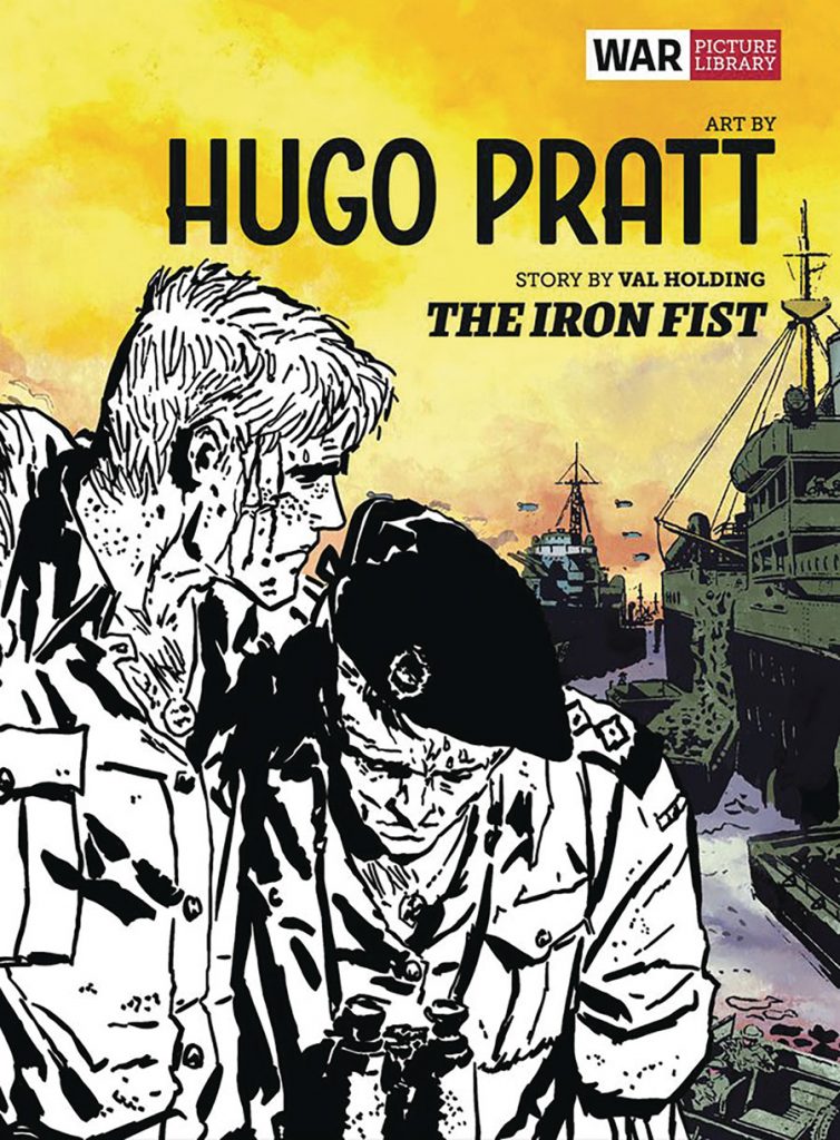
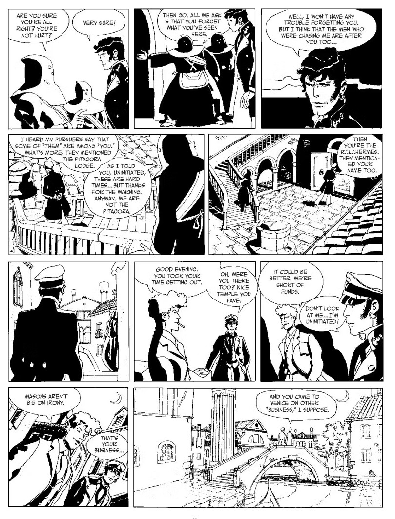
War Picture Library: The Iron Fist is the latest in a series of books1 by Rebellion / The Library of British Comics reprinting works illustrated by the great Hugo Pratt (Corto Maltese, Sargent Kirk) from his British period in the 1950s and 60s. In this book – it’s three stories from the War Picture Library Series.2 In case you haven’t had a chance to experience War Picture Library, and its many brothers and sisters,3 which is likely the case (unless you are a British person over the age of 40), these were small, digest-sized, booklets, each containing a full story. Due to the small size and the focus on readability for a young crowd, layout structures were as rigid as they come; the usual is two panels, upper and lower, per page; with occasional sprucing for a three and even four(!) panel page if the artist was particularly daring. Despite being 60 odd pages, with a spine even, these stories were actually rather sparse if you do the math: 64 pages with two panels per page is probably fewer panels than your average American comic book of that era. This doesn’t necessitate less complicated plotting,4 but that is what usually happens.
If one wishes to experience these books, particularly the war stories5, as they were, then you should look for the Welbeck Publishing Book collections. These are big fat books that are actually pretty light on both weight (printed on thin cheap paper) and content. Trying to read an entire such collection in a day, even considering the low panel count overall, is an act verging on self-harm (to the mind, at least). There is something almost numbing about the sheer repetition of the plotting and visuals. Whether the story deals with pilots, navy sailors, ground soldiers, or someone working the kitchen6 you can be sure to encounter an amiable protagonist who encounters troubles from his own side to a superior officer failing to understand him, there’s some trouble but eventually the conflicting soldiers come together to fight the actual enemy and all is well; at which point you realize there are probably twelve pages left and story dregs on for another combat scene because there’s a quota to be filled. There are usually no credits, not unusual for British comics of the time, and despite reading dozens of these in the Welbeck collection, I couldn’t quite tell you if one stands out (artistically).
Commercial comics are often made to formula, but in the case of War Picture Library, the formula is constraining enough to make EC Comics famously pre-made layouts appear almost like an avant-garde. So why read War Picture Library: The Iron Fist, never mind the previous four in the series? Well, because it is drawn by Hugo Pratt. That is enough of an answer to most questions. I would gladly read almost anything Pratt had drawn. Maybe it is despair due to a lack of possibilities. Other than Corto Maltese, a series that was fully translated by IDW / EuroComics in one of the noblest efforts for bettering the world of English-speaking comics7, and the single-volume graphic novel The Man from the Great North, most of Pratt’s work remains untranslated. I’ll take the scraps offered by War Picture Library over staying hungry.
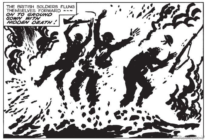
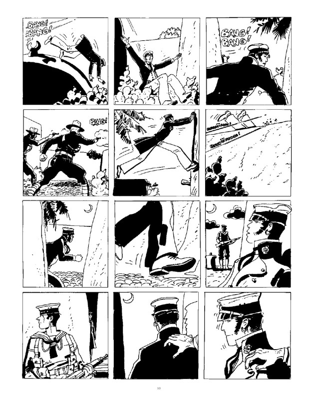
Take a look at two panels from the 2nd story in this collection, “Strong Point” – the first showing soldiers charging forward and the second showing soldiers exploding under a deadly barrage. You can see, critically, how Partt is probably working according to deadlines and the demands of the page. In the panel showing the explosion, both the human figures and the ground erupting around them are made from the same solid black spots. While the soldiers are indefinably human, if only sketched, the ground and background are closer to pure abstraction – the idea of explosion rather than the fact of one.
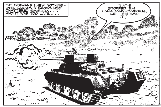
If this looks like I’m badmouthing Pratt here that is not my intention. This is an artist finding strength in simplicity, making a story that is, in plot terms, just a series of events connected by the most basic character arc possible, into something far grander. Like another master who had the misfortune of working within a constraining system, one Bernie Krigstein8, Pratt can be seen bravely fighting to wrangle art out of assembly line comics. Compare these two panels to the more mundane stuff such as the title story. A panel showing a tank in action is probably technically superior, but the eye is quickly drawn away from the tank itself, a dull (if well-crafted) piece of machinery, towards the way Pratt chooses to illustrate his sparse backgrounds. The desert is so abstract it approaches Krazy Kat levels. Pratt was a great environmental artist despite, or because, how often his backgrounds were non existent9; he could do with a dozen lines what a lesser artist needed a thousand to do.
Still, Pratt’s greatest skill, both as a writer and as an artist, was people. The problem with many classic ‘adventure series’ (from Captain Easy to Tintin) was how quickly they surrendered to shortcuts, stereotypes, in characters outside the core cast. The artist of these strips mistook the map for the territory, and thus the world they presented (and the people that inhabit it) were as flat as map10; rather than fully rendered three-dimensional characters. Consider the first Corto Maltese album, The Ballad of the Salty Sea. It’s a faulty work on its own account, filled with stop-and-start plotting that is obviously a result of serialization, but not in a way one would expect a European work from that period. Pratt depicts a world of clashing ideologies and sides, the British, the Germans, local pirates, citizens caught in the crossfire, Pacific Islander revolutionaries, and Corto Maltese himself… each is depicted with full humanity, each with their own goals and desires.
I wouldn’t claim to know if the way Pratt depicts various Pacific Islanders in the album is historically accurate, but to the outside observer it appears so; none of them speaks in pidgin English, and none is depicted in any way less resourceful than the white character. This sets the tone for future volumes of Corto Maltese in which different cultures, from Ethiopians to Irish to Argentinians to Ottomans are given proper depiction. Which does not mean the comics treat them like some noble savages11. The characters of Corto Maltese stick to mind because they are fully human. The scoundrel Rasputin (not the historical figure), who would do anything to survive; Jack London (yes, the historical figure) who is brave and boastful even when he knows it will be his undoing; the doomed Captain Slutter, slave to his own high ideals (even if he knows the masters he serves do not care); Timur Chevket, who plays all sides to come out on top.
These people are borne out of their time and culture, but they are not only that. Compare them to figures of The Iron Fist collection. I will not speak of any that are not the main characters; the German soldiers who are simply pushbutton dolls that exist to shout “Donner and Blitzen” before falling to the ground, in a properly PG manner. But even the main cast throughout most of these is forgettable in their behavior and psychology. The sergeant in “The Big Arena” who starts out as tough and unyielding, but quickly learns to appreciate the conduct of the men under his command, is a good example: there is a character there, but it is purely mechanical in application. He is there to learn a lesson. To be moved from point A to B12.
Consider the majestic opening of Under the Sign of Capricorn which depicts Corto Maltese simply sitting in a chair, soaking-in the environment; when the narration claims “even in repose, it was obvious that he was ‘a man of destiny.’” And the way Pratt draws him, you believe it. There is so much of it throughout the various Corto Maltese stories, people sitting, laying down, chatting… stuff that should be dull but is charged in a unique energy. The War Picture Library stories, on the other hand, are filled with action; with happenstance. The stories often don’t simply involve a single battle but several of them in a row. “The Iron Fist” (the first story in the collection) keeps jumping from scenery to scenery, event to event, it’s all process and no contemplation. There is no time, in such a story construction, to soak in anything, never mind the characters.
Minutes after closing The Iron Fist I begun to forget its protagonists, they all shifted within my mind into a single slush of ticks and generic identifiers. Likewise the scenery, though the stories Pratt drew take place all over the world. I could remember bits and pieces, the drawings, but not really the sense of a place, the sense of the people that inhabit it. It might be unfair to compare War Picture Library, a job made for cash illustrating someone else’s words, to the freewheeling self-expression of Corto Maltese. It’s even plausible to say, having read but the small tip of thousands and tens of thousands of pages published in their various booklets, that these Rebellion collections represent the best of the best. To borrow from H.G. Wells – “It’s a considerable thing because you are a very considerable man”13. War Picture Library: The Iron Fist, for its faults, is a considerable thing because Pratt was a considerable artist. It is worth reading for these moments, small as they are, in which his genius shines through the scripting and the constraints of the format. The history of comics is filled with great artists who, sadly, had to dedicate their talents to illuminate scripts that never rose to their crafts.
There is another good thing, a great thing even, these War Picture Library did. They made me crack open these old Corto Maltese collections once more. A more noble contribution to culture you will not find.
- Following Battle Stations, Battler Britton, Night of the Devil and The Crimson Sea. ↩︎
- Not be confused with War Picture Weekly which, as home of Charley’s War and Major Eazy, aged far more gracefully. ↩︎
- Air Ace Picture Library, Action Picture Library, Western Picture Library etc…. ↩︎
- The Courtyard by Anthony Johnson and Jacen Burrows does quite a lot with a two panel-per-page structure throughout. ↩︎
- Probably the largest chunk of the lot, being the dominant genre in British comics post-WWII until the late 1970s. ↩︎
- There has to be one somewhere. ↩︎
- Naturally, it is now out of print and going for crazy prices on eBay. ↩︎
- Pratt, of course, wound up with kind of creative freedom Krigstein could only dream of in his brief career. On the other hand, Pratt never could make the British stuff he drew into a masterpiece like “Master Race” of “Key Chain.” There was a limit to his powers. ↩︎
- Seriously, large chunks of Corto Maltese involves the characters existing in seemingly featureless white spaces. If it wasn’t ‘necessary’ for the scene Pratt didn’t draw it. Which is fine, part of being a good comics artist is knowing what not to draw.
↩︎ - I was, and am, a fan of Tintin; and while Herge certainly gotten a lot better in presenting non-white characters after the first three albums he never quite got over his self-admitted ‘paternalism.’ The latter albums are more favorable in approach, never quite as deep as they aspire to be.
↩︎ - I think now, of several European Western comics I’ve read, from Blueberry to Tex, whose attempt to ‘correct’ negative historical depictions led to modern depictions that are just as empty as their older counterparts. People, actual people, have faults as well as qualities. ↩︎
- At this, at least, he is better than the protagonist of the Battler Britton collection – who starts up as the perfect soldier with nowhere to go. ↩︎
- From a letter to James Joyce following the publication of Finnigans Wake. You can practically hear the “but” following that line, ↩︎
SOLRAD is made possible by the generous donations of readers like you. Support our Patreon campaign, or make a tax-deductible donation to our publisher, Fieldmouse Press, today.
Leave a Reply