“I was just obsessed with faces, obsessed with people. Like, I’m gonna draw you at some point,” pointillist caricature cartoonist Drew Friedman tells Jay Ruttenberg at The Comics Journal. Charles Burns, who used to grace each issue of The Believer with a quartet of faces, says a similar thing: “I’m slowly learning to draw every human being in the United States.”
These innocent quips about “every human being” and “you” add up to the fantasies of A.I. facial recognition and surveillance technology! Of capturing every likeness, that each person will be accounted for. It is the promise of the face as a bearer of bare truth. But faces “shift and layer” (Serpell); faces suffer from “a prior gridding” (Deleuze & Guattari), a constraint. The face papers over its own instability and the power of those who demand a face.
I plan to look at a series of portraits of vulnerable people in comics: the foreboding poses in R. Kikuo Johnson’s recent New Yorker cover (2021), the indigenous storytellers who anchor Paying the Land by Joe Sacco (2020), and the ordinary overwhelmed teenagers in Derf Backderf’s Kent State: Four Dead in Ohio (2020). These are images against racism, colonialism, and state violence, respectively, and the face is the entry point to a structural critique. These critiques, however, reproduce what they object to; the face does not deliver.
In many uneven ways, 2020 hinged on the question of whether you were living for yourself or for others. It was the year of the light blue medical mask over darker blue scrubs. In fact, these items were Time magazine’s Guardians of the Year: its end-of-the-year issue put a group portrait of clothes on the cover with a few marks of individuality on each worker, flanked by featureless others receding into the distance. The written profile inside testifies to how these are real people with names, but the group portrait slips into anonymity.
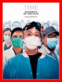

Squint and the Time cover evokes British painter William Tillyer’s un- or anti-portrait titled “Portrait Head and Shoulders” (1978): the red border, the white in the center, the blue below. Tillyer strips away the painterly bestowal of dignity by way of likeness that makes up portraiture, and gestures to the phantoms of those who simply would not qualify to be a sitting subject. It is interesting how professional dignity and faceless anonymity resemble one another! Time unwittingly participates in the ongoing abstraction of those at the pandemic’s frontlines.
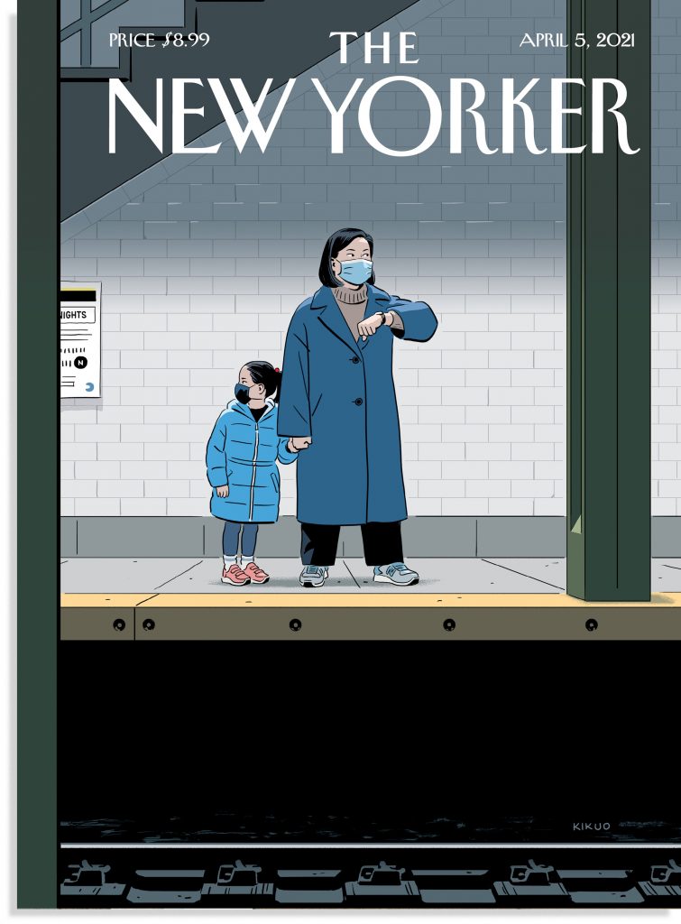
There is a similar slip of representation on R. Kikuo Johnson’s recent New Yorker cover “Delayed” (2021). Johnson’s timely image responds to the mass murder of Asian women in Atlanta in cool, not lurid, colors: a series of hues of blues and grays with two bright pops (the daughter’s red hair tie and pink shoes). The coats are just perfect, and the masks are essential because they multiply the sense of threat. Underneath the mother and daughter, between their feet on the platform and the machinery of the rails, is a solid black band, almost able to stand in for any number of structural or unseen threats: an epidemic of hate, the global pandemic, the practices of carding and subway policing, the war on unhoused people, and so on.
If the Time cover is heroic and impersonal, then this is humanistic and much too tense. Hanako Montgomery at Vice narrates what the image depicts: “The train hasn’t come. A mother holds her daughter’s hand and raises her wrist, as though to check the time. But the woman is not looking at her watch. Something else is on her mind. Her daughter looks behind her shoulder. Something may happen to them. Something bad.” I also like the mental gymnastics of the image: faces not betraying thoughts, thoughts not betraying body, gestures not suppressing fear…
But in Montgomery’s reading, the cover freezes this moment in time before the violent “something”—this can only mean that that violence is inevitable. The cover feels fatalistic then, and dependent on that violence, and on the pandemic, too, which is pretty damning given the meager amount of Asian American representation on the cover of The New Yorker over its long history. What is “delayed” is a New Yorker that does not have to wait for a spike in anti-Asian violence. So this “powerful” and “heartbreaking,” “subtle” and “poignant” cover is not able to imagine the face free from the mask and free from the violence that renders these persons visible. I find that heartbreaking and intolerable! It frames empathy so well that the larger frame is more vexing.
Joe Sacco goes for empathetic portraiture over the noodly arms of yore in Paying the Land (2020), his longform reporting on the Dene in the Northwest Territories. Many chapters are centered around the faces of Indigenous storytellers, leaders, and organizers, who guide Sacco through the extractive industries and colonial legacies in Canada. The first chapter opens symbolically with a newly born baby, succeeded by communal scenes of canoe-building and hunting, as a voice describes living “out on the land” (4). Four pages later, Sacco shows who is speaking by placing his first interview subject, Paul Andrew, in a black panel in the center of the page.
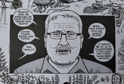
The introduction of the face is also the introduction of Sacco’s journalistic voice: “Per family?” he asks off-panel (7). This minor intrusion (a question) builds, and later on Sacco cops to being as extractive as the neocolonial industries he hears about. This admission is probably going to be the most discussed bit from this large book; surprise surprise, it is a meta moment centered on Sacco himself where he calls journalistic objectivity in question. Declaring one’s complicity is just a shortcut to the structural.
Paul’s face arrives fourteen more times. This first chapter is a tranquil set-up, with lovely off-the-cuff memories, a back and forth like in an Errol Morris documentary; it is a casual preamble before Paul goes in-depth on the terror of the residential school system later in the book. (That thirty-page chapter at the center is stunning.) Here, I get the sense that Sacco is being extremely careful with Paul’s face, reserving caricature for himself only. He is trying to get it right, to honor likeness and studied representation, to create intimacy. Paul’s drawn face, however, is solidly unchanging: no eye movement or head tilt, maybe a mouth shape alters.
In a sense, the easiest thing to depict in a narrative about decades of depredations is the face as it looks today. If you have only made two visits to the Northwest Territories, then a photograph of your subject is all you need. Trace it and trace it to make more faces. None of that is a knock on Sacco, but the primacy of the face papers over his being there. The images are the same. All I see are photographs, not comics, and distance, not intimacy.
Derf Backderf’s Kent State takes matters even further: goodbye faces, goodbye empathy.
There is something tonally god-awful about the late sixties and early seventies: awful to watch, like a smiley face pressed into a juicer, and awful to read about, “The charm had broken,” etc. The narrative, for white and Black activists, is merciless, and for utopian dreamers and ordinary teens too. Kent State is a graphic novel about the ordinariness of some ordinary teens, whose lives are altered by the draft or deferment, by (dis)avowals of campus radicalism, and by the surveillance on campus and militarized occupation of their town.
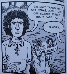
The students are so normal and plain that they all have the same noses and eyebrows! They are still fun to look at because Backderf is a great cartoonist: chunky fabric folds and boxy bodies, that beautiful bigfoot syndrome. It is anarchic to see Jeff Miller crouching and sprinting in zany shapes, hiding out in alleys and evading helicopters and tear gas as he tries to get home after curfew. The students are bundles of well-researched anecdotes and idiosyncrasies (actual words said, t-shirts worn), but they have no graphic power.
Over time, Kent State and its ordinariness are hijacked by two things: the National Guard and the action comic. The story is told over four days, May 1-4, 1970, with a brief prologue tethered to ten-year-old Derf’s perspective on April 30: he sees the bayonets of the National Guard as it is marshaled against a Teamsters strike. The bayonets glint in the sun, they poke through the black border of the panel. I will not psychoanalyze Backderf except to say that it seems significant that these imposing images of the troops originate from a ten-year-old’s point of view. On the one hand, Backderf is very good at depicting the up-close terror of gas masks and rifles and bloody bayonets. This offers an emotional charge from the students’ perspectives. On the other hand, the guardsmen look badass, they have style, an iconography, which the students do not. The masks, not the faces, provoke and compel.
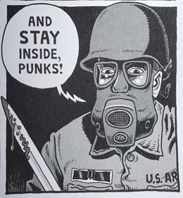
Kent State is trying to be a scholarly book, with thick textbook explainers and endnotes, but the actual Kent State shooting shakes off that dress. During the action-packed scene, Backderf editorializes in the captions about lives cut short, young people in their prime, and so on, though this empathy sounds artificial. Strange to say that the best part of the book is the killing of the students! And why is it that when Backderf signs books he doodles a menacing guard? And why is his Twitter profile also adorned by guards?
The outsized presence of the guards, who are very much the villains, fills a vacuum in the book since the four students are pretty blank and just groovy. Though they do have names (Bill Schroeder, Allison Krause, Sandy Scheuer, Jeff Miller), their individual faces promise nothing. They are not intimate images like R. Kikuo Johnson’s vigilant family or Joe Sacco’s realistic storytellers. They are crushed in so many ways…even by Backderf.
I am not suggesting Backderf is not himself empathetic, or that the comic disparages these deaths or glorifies the killers. Rather, Backderf’s brilliant intervention is not scholarly but graphic and drastic: the depiction of stunning savage violence at the expense of all the human individuals. Just when it seems like Backderf’s critique of the military industrial complex is about to collapse, the overwhelming and spectacular geometric intrusion of the lines does a better job of critiquing violence than the comic as a whole!


Backderf draws the bullet trajectories with ruled straight lines of almost diagrammatic quality, a grid imposed over the top of the scene, sixty-seven shots eating up the air. He wisely makes no attempt to render the lines as cartoon speed lines with whiz sound effects (though there are plenty of lively thops, clunks, and bangs throughout the book). And no bullets! Instead, they are overwhelming lines from without, like the ruler used by the cartoonist, forced onto the panels of the comic, bisecting, rebounding, chopping up space, killing and wounding students. Every panel is more claustrophobic and dangerous for this choice.
Even though the notes at the back try to suss out who gave what order or who fired first, the grid of bullets evades this riddle of personal responsibility. The art knows better! It does not matter which bonehead panicked or power-tripped or fired as a warning: it is, instead, the total impact of pure outside force and violence, and utterly shocking and disgusting for that reason.
No longer representing the soul, the face after modernism was instead “reconvened as a structure” and “a grid,” according to John Welchman. The face is eroded by “distortion and reduction.” You might remember Dana Schutz’s offensive painting of Emmett Till’s brutalized face (2017): Schutz makes exactly this kind of geometric modernist face…for a cheap provocation and harmful effect. It feels like the empathetic faces I have discussed are on some level atoning for Schutz’s appropriation of the face of the other. They are respectful, dignified, and well-intentioned.
Backderf does not even bother with the face, or with likeness, dignity, and vulnerability. The forces of repression have already stripped the students of these things. The guards demand a face. Just look at how funny this panel with Jeff’s ID is! That is supposed to confirm identity?
The grid of gunfire bypasses the empathetic demand of the face completely. Despite all of the real details poured into these individual students, they remain lost souls caught between the facts of biography and violence. The lines let us see what we cannot see.
SOLRAD is made possible by the generous donations of readers like you. Support our Patreon campaign, or make a tax-deductible donation to our publisher, Fieldmouse Press, today.
Leave a Reply