This month’s column takes us back in time on a journey through various forms of what we might call pulp, beginning with a comic I paid 50 cents for and ending with a comic that would have cost ten cents in 1952. I love this stuff, I breathe this stuff, and my bedroom is terribly dusty on account of this stuff. No more snarky intro this time I wrote ~400 words about a Batman comic from 1989.
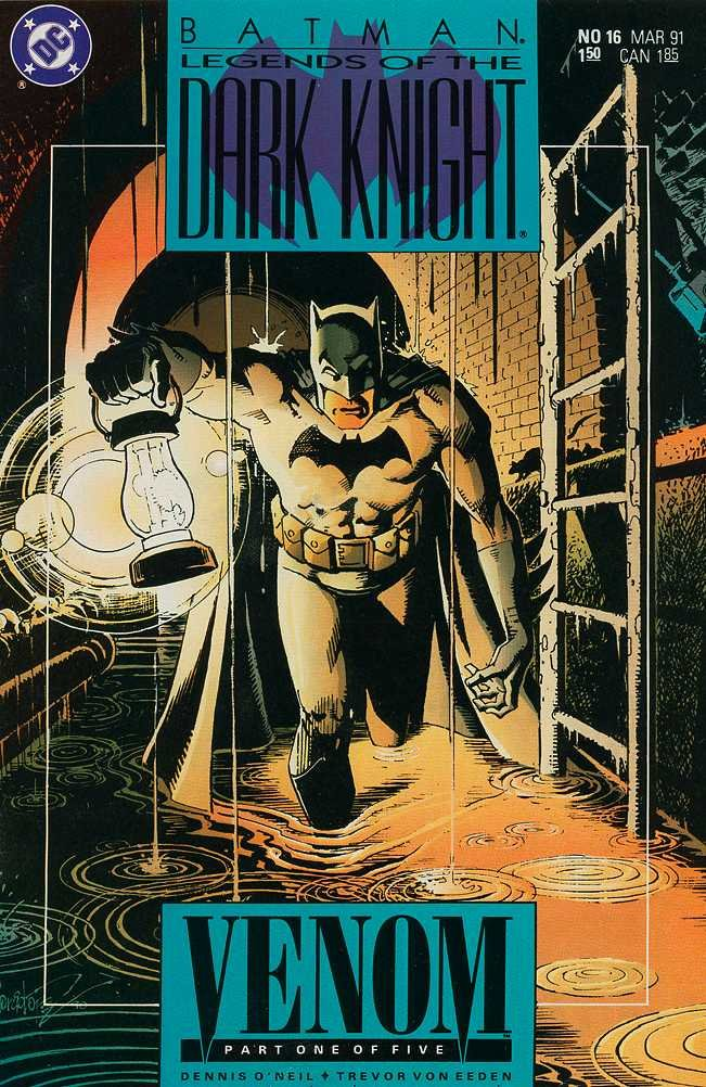
Batman: Legends of the Dark Knight No. 16 – Venom Part One of Five is the kind of comic I’m always seeking out when I raid the 50 cent bin, a work that screams miscellany yet boasts a level of craft that would make today’s most lauded superhero “talents” soil their trousers in fear, containing a story that I can sink into like the warmest bubble bath of pure grit. The story in this one is total old-time radio red meat – witnessing the death of a little girl, Batman is tempted by performance-enhancing drugs crafted by her strangely chipper father in his dogged pursuit of the murderous kidnappers. There’s a perfect blend of grim reality and emasculating psychodrama that practically demands the reader imagine the voice of a Jack Webb or a Larry Thor purring beneath Batman’s cowl. Dennis O’Neil’s script uses the word “patsy” a couple of times. I’m in heaven.
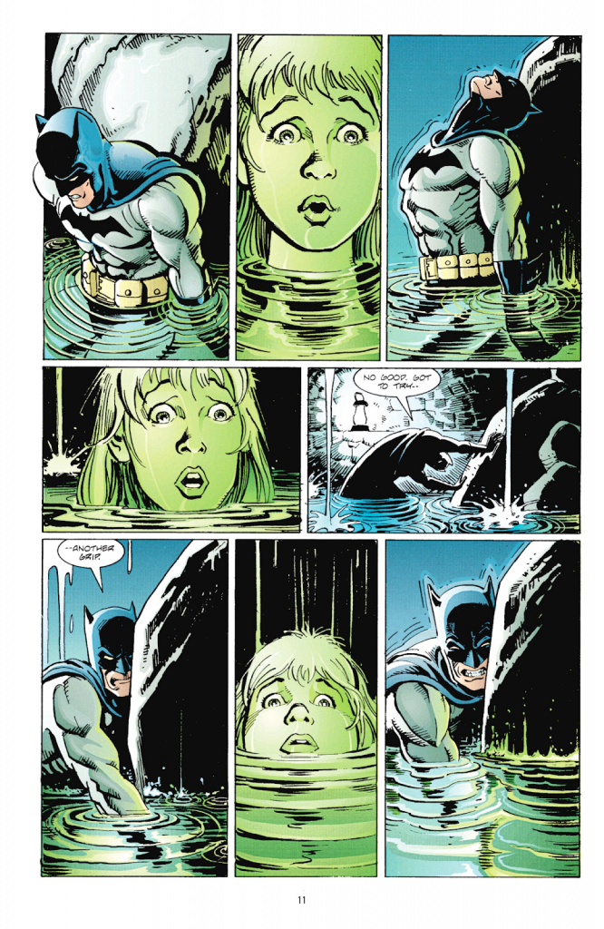
The highlight of this comic however is its visual execution by everyone involved – the breakdowns by comics god Trevor Von Eeden lend the same fluid, expressive viscerality to the action as found in his most abstract solo work, bolstered by the weight and clarity of Russel Braun’s pencils and swallowed whole by the brilliant and humane detail of the inks by Jose Luis Garcia-Lopez, a man with quite possibly the most wildly diverse career trajectory in comics history. The results are breathtaking, yet they contain consistent sequences that reveal their craft as you read. Steve Oliff’s colors really stand out here, subtle gradients peppered with blocks of striking solids, attention to light sources adding genuine depth to the artwork that complements the dexterity of the cartooning on display, and incredible deployment of white highlights that complement Batman’s dissociated inner world in this story. At a distance, I’ve always found Oliff’s style a bit off-putting, as it reminds me of the bland light digital color all comics have these days, but when you read a Steve Oliff comic from the late 80s you can really appreciate why his colors made such a splash – his colors are meant to be READ! This just comes together as something like the perfect mainstream comic, something you could study for hours that’s designed to be blazed through on a sunny afternoon in a crowded streetcar. Truly choice reading.
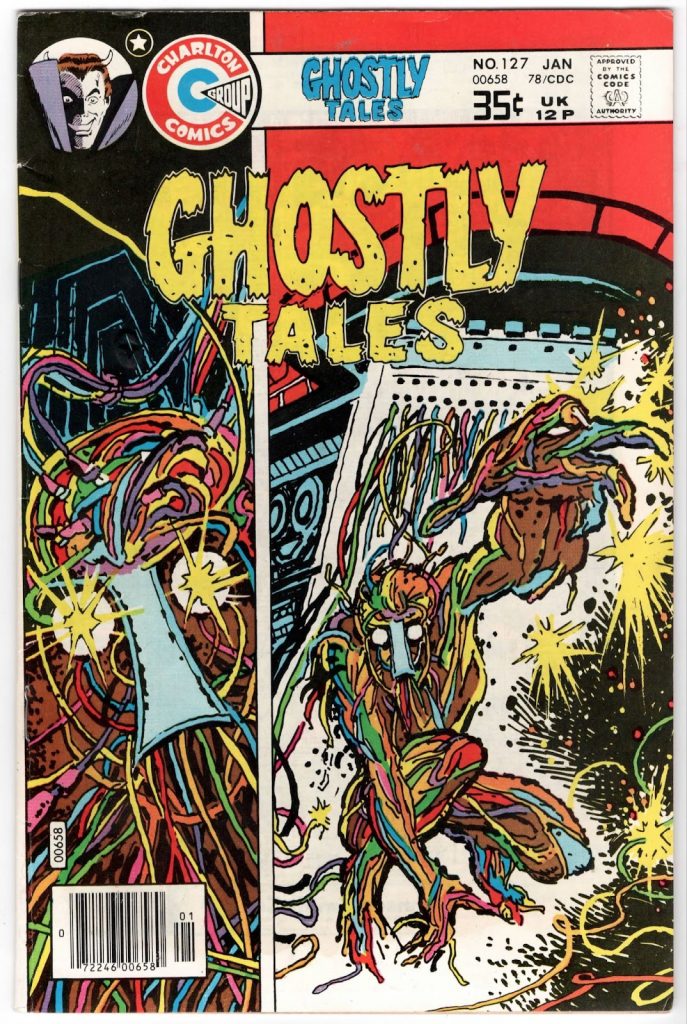
This is a comic published by Charlton Comics in 1978 and, if you know what that means, you know what that means. Holding this comic in my hands, I believe the anecdote about the printers at Charlton never being turned off – you can smell it, you can feel it. There’s a texture to the ink and the newsprint that speaks of screaming gears. The contents are most likely all reprints. The cover is a blown-up interior panel – a great panel mind you, it’s the reason I picked this one up. That first story, The Wire Man, is drawn by fantasy art favorite Tom Sutton, whose work I first encountered in a wonderful and brief stint on Marvel’s Godzilla, and written by Charlton sci-fi guy Nick Cuti. It’s a genuinely chilling body horror short with a proto-Barry Windsor-Smith vibe about an android who departs from his makers’ laboratory unfinished, a fearsome mass of writhing red and blue wires and pulsing yellow lights for eyes. The very sight of this body without organs scares people to death; soon he literally learns the meaning of human fear. Sutton draws the absolute hell out of this, gonzo panel structures that would be at home in Tezuka’s Phoenix, thick brushstrokes and canted angles selling the dizzying tumult of the machine consciousness’ terrifying entrance into a human world, of flesh, wind, and concrete. What a good comic.
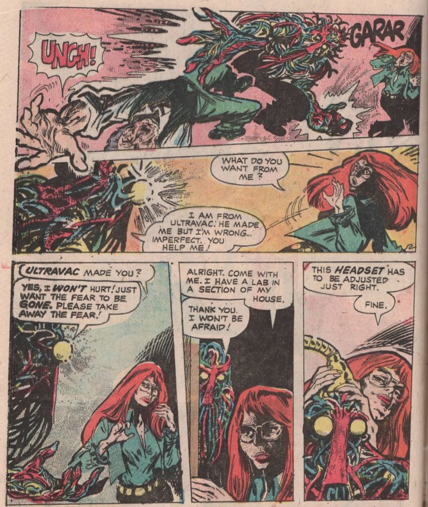
The remainder of Ghostly Tales No. 127 is filled out with a clearly pre-code crime quickie illustrated by Rudi Palais with really solid inks and a satisfying grizzly death at the end, and an uncredited naval horror short that, to my untrained eye, appears to be drawn by Pat Boyette, which features many thrilling illustrations of crashing waves but, to be honest, I just skimmed it. This is what American comics look like when Charlton publishes them – fast, formulaic, furtive, contents read by no one, okayed by censors with indifference, stories drawn for a totally indistinct mass market while no one was looking smuggled into 30 crusty pages of whatever fit. I love that shit.
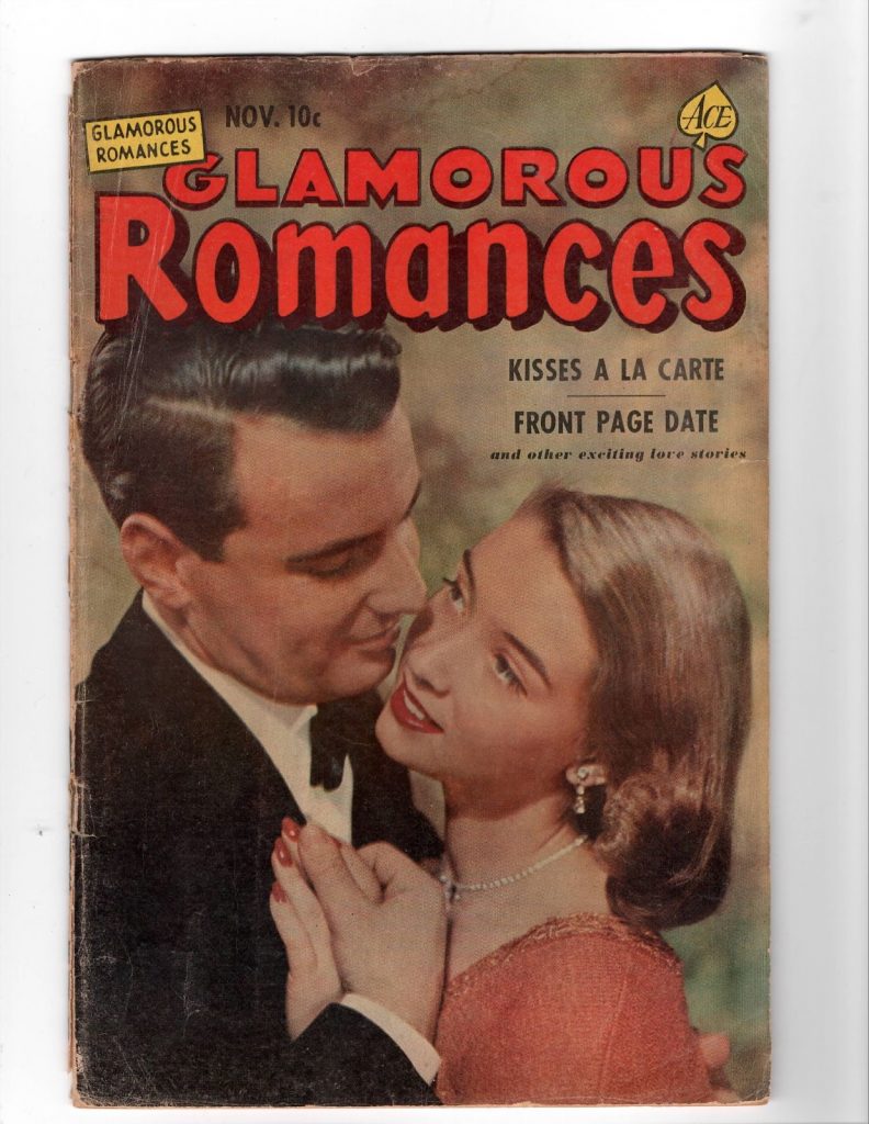
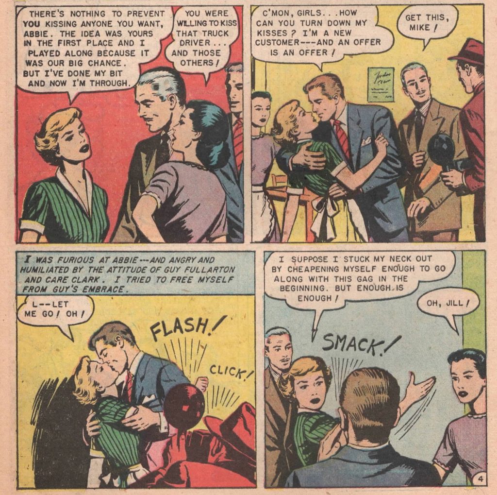
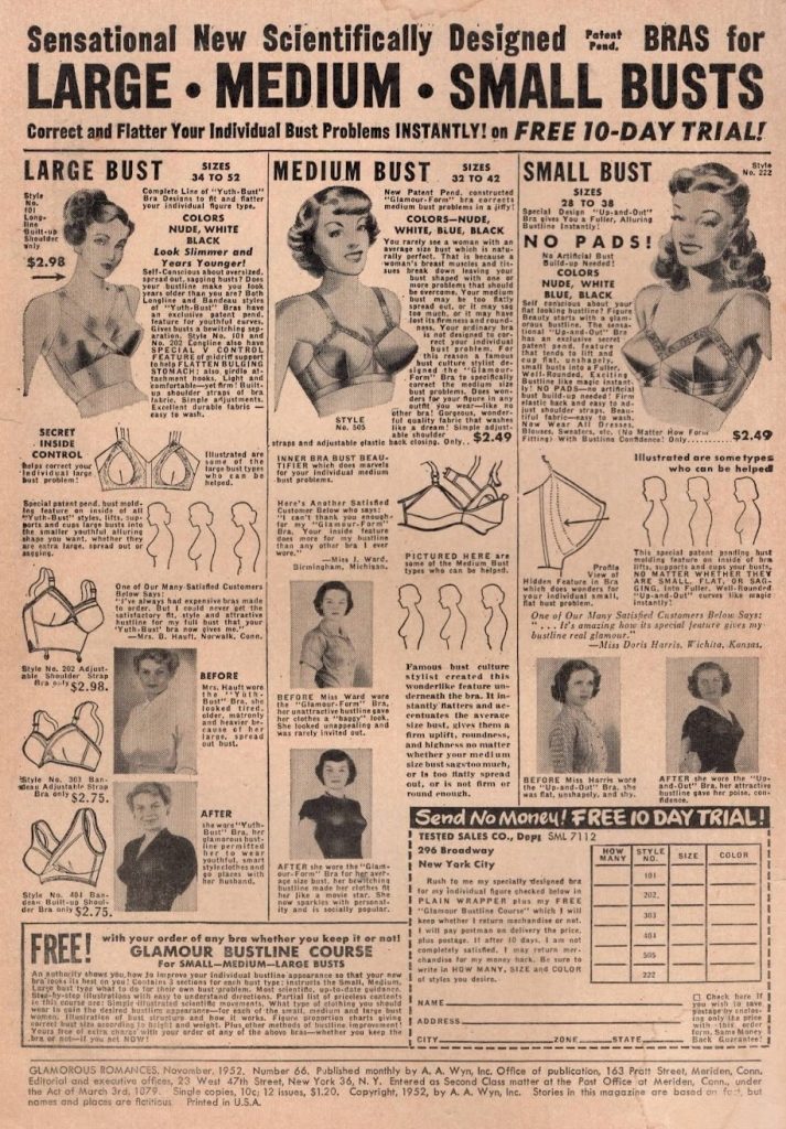
Glamorous Romances #66 belongs to one of my favorite genres of American comics, fly-by-night cash-ins on the runaway success of Simon and Kirby’s Young Romance series. 50s romance comics are a true form of pulp, a tour-de-force of action without resolution, sexually repressed and emotionally frustrated sublimated class allegories, stories of the inner lives of women by working men who would likely rather be doing something else. Between these tawdry, crumbling covers you’ll find a series of totally anonymous picture stories with such stirring moral messages as “cook for your man,” “be loyal to your man and cook for him,” “obey your man, who respects you,” “let your man make you pretty,” and “dump your boyfriend and marry a man who won’t cheat on you.” And, of course, these messages are delivered in the most demented, convoluted manner possible in the bounds of four or five pages – in Kisses a la Carte, two women running a failing restaurant bring droves of men to the establishment by advertising a kiss with every meal; in Front Page Date, a magazine pays for a woman to visit her long-distance boyfriend in New Orleans on the condition that a handsome photographer accompanies her; and so on. Women are treated – and treat themselves – like property in these stories to an absurd degree that alarms me as a feminist but delights me as a lesbian with some kinks and a love of messy, lurid drama: high school sweethearts betray their morals, love triangles are settled by the highest bidder in a market of sexual etiquette and, at times, perhaps, implied trade for sexual services for goods and good behavior (and money).
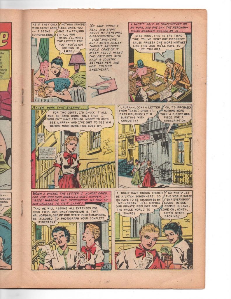
The art in Glamorous Romances #66 is frequently pleasant and polished, if a bit stiff and stagey, and the colors in my copy are remarkably vivid despite the tattered, yellowing state of the magazine itself. Truly an industrial work. Aesthetically, the aforementioned Front Page Date is the highlight and the only story executed with any sort of individual flourish, its artist(s) deploying a slender, Bill Everett-like line that lends texture to fabrics and gives dames eyes like daggers. But honestly? When it comes to comics like this, they’re all winners. There’s also a little prose section midway through detailing some truly disturbing beauty tips and a few surprisingly sensible suggestions for shopping for comfortable shoes. Not much has changed since the 50s really, it’s still hell out there if you’re a damsel with collapsed arches. Point being, I love comics like this, I lap them up like a kitten drinking milk, feed me more, please. I’ll be good.
—
That’s the column for this month. As you can see I am a massive freak, and if you read more comics you can be just like me. My friend Nina is still crowdfunding her laser treatment and could really use some help. Cartoonist and printer Ruby May Valentine (who you will remember from last month’s column) is fundraising for the purchase of a risograph printer which will help her establish herself as a publisher and deserves support. Be kind to gay people and struggling artists in your community – there would be more lurid shit these days if more of us had the piece of mind to make some. LOVE COMICS XO
SOLRAD is made possible by the generous donations of readers like you. Support our Patreon campaign, or make a tax-deductible donation to our publisher, Fieldmouse Press, today.
Leave a Reply